
ARTIST STATEMENT:
My finalised video for this semester is a VR video work imagining a dead game corrupted by the passing of time. I’ve reconstructed Wii Sports Resort’s Wuhu Island as a dark fantasy world, devoid of life and consumed by pulsating glitches. What does a space built for play look like when all the players have moved on? What does a childhood favourite game look like when reformed out of the haze of long-gone nostalgia?
First thing we did in the semester was the Three Body Problem project, which I honestly don't have too much to talk about. It felt more like a warm-up than an artwork I was super proud of. I did it in the same stop-motion of appropriated old illustrations that I had made some stuff in the foundational video workshop in the previous semester. I think I probably would have liked to have utilised the three screens better – it kind of just ended up being each person in the group making their own artwork and displaying them together. But it was an interesting experiment! Here’s the video I made.
This semester had a strange start that I think ultimately pulled me in the direction of my final project. Pretty early on in the semester I got COVID, which I’d had before, but this time really wrecked me. I was bound to my bed for a week, experiencing feverish hallucinations whenever I tried to sleep, waking up from bizarre nightmares in puddles of sweat. I spent a lot of this bedridden week watching YouTube and reading TTRPG rulebooks, and I found that the content I was consuming coloured these fever hallucinations intensely. I was watching videos about cults in MMOs and explorations of dead video games, and reading a horror TTRPG called Heart about descending into eldritch psychological hell. Then as I laid there, completely unable to sleep, fighting off a terrible fever, I’d have weird hallucinations that combined these worlds. I felt like I was in a weird hollow digital hell where the world was corrupted and destroying itself, and the tangle of bedsheets I was writhing around in was the breathing, pulsating world of the game around me. It was super weird.
This was one of the videos I would spend my time watching, by YouTuber Redlyne, exploring dead games. As a kid, a not insignificant portion of my time was spent playing MMOs with friends and strangers alike, building community in digital spaces. Such spaces are temporary – the player base might die out, the money funding the server might disappear – which leaves behind a sort of eerie digital detritus. Spaces built for players to explore and interact with one another become devoid of life, with only the infrastructure that once served to facilitate play to remain. It’s a little like the amusement parks of Chernobyl. I revisited personal left behind Minecraft servers from my childhood, and was struck by how sad it made me. There’s the typical nostalgia of revisiting something that once meant a lot to you, but there’s a sadness on top of that, as a space built for play and community now can’t facilitate that. So, I got an interest in “dead games” and the eerie, strangely beautiful spaces of them. And then I’d have those hallucinations that combined that with a fantasy horror type of aesthetic. So, while COVID completely wrecked my momentum at the start of the semester, it gave me the singular inspiration for what would end up being the project that I spent all my time on this semester.
It still took me time to reach the proper idea for my project, but this was definitely still percolating in the back of my mind. At first, I was loosely interested in making an art game. But without any experience in game development really at all, I was considering simple alternatives. There was a brief period where I experimented with Bitsy, a very simple game engine for little pixel-based games. I thought it was cool but, because it’s so limited, it was hard for me to come up with any ideas that really grabbed me. I also thought about maybe continuing on a work from the first semester, but I ended up feeling like I wanted to tread new ground.
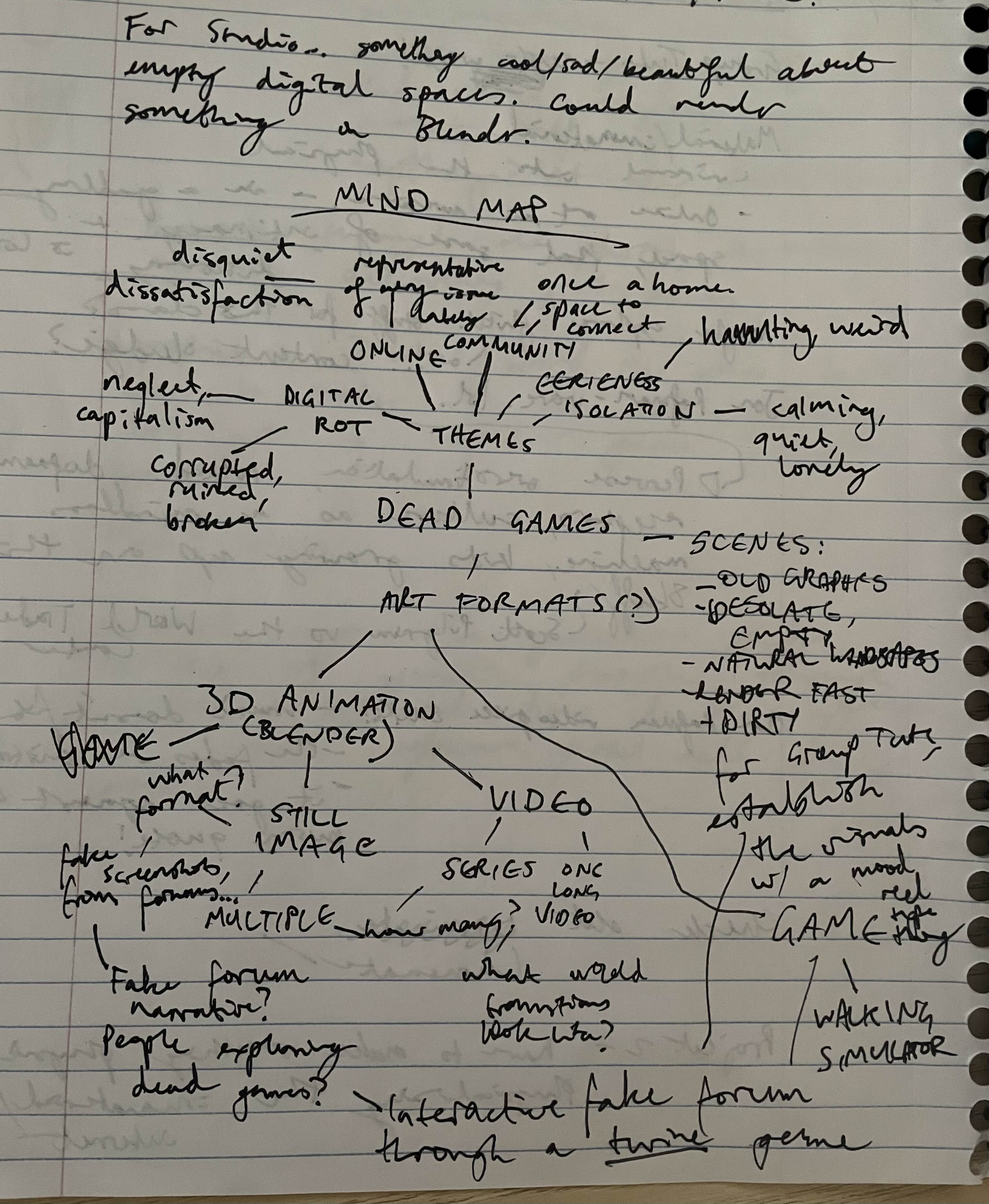
Maybe four days out of the group tutorial in Week 6, I was panicking for a lack of ideas. But in my mind, I kept revisiting that weird hallucination I had. Also, I took Post-Internet Art as my workshop this semester, so my distaste for the internet I touched on in the previous semester was further blossoming. Dead games, digital rot, and dark fantasy were on my mind. Here’s a mind map I made in a desperate attempt to come up with some way to turn this into an artwork in just a couple days.
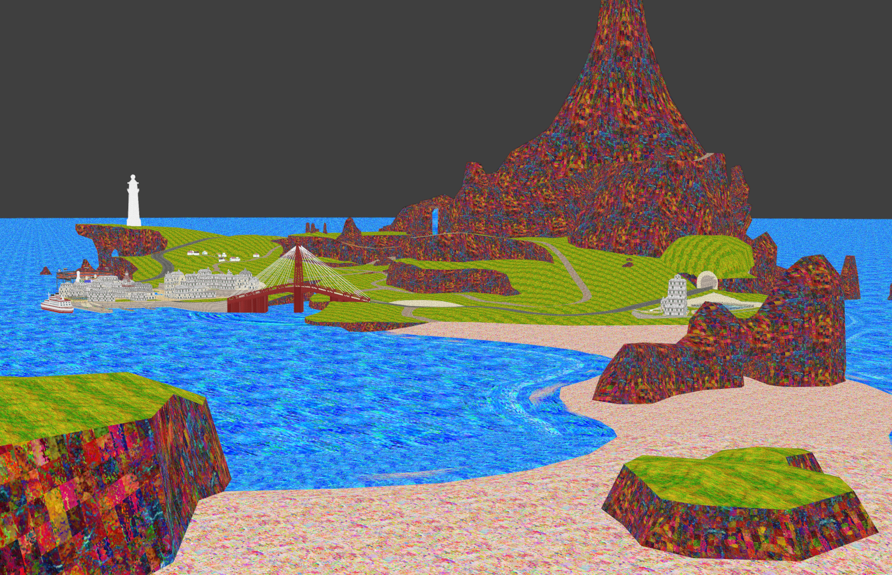
I was playing with a couple different ideas here – I thought about emulating old video games forums with a text-based Twine game, but was also thinking about a walking simulator. That’s the direction I ended up going in. Pieces started to fall together as I revised these ideas further; eventually I thought to revisit Wuhu Island, the locale from Wii Sports Resort that I had also touched on very early in Semester 1.
It’s a location that existed firmly in my imagination throughout my childhood – a cartoonish beach paradise, where all anyone has to worry about is playing basketball, throwing frisbees to their dogs, sword-fighting contests and wakeboarding. The visual aesthetic of it feels very much rooted in its time. Being released in 2009, it was in the grasp of the Frutiger Aero look, a retroactively named design trend found in user interfaces, web design, and Nintendo games like Wii Sports resort. Bright blue skies, lush green grasses, tropical fish – it’s a ridiculous, yet kind of charming, utopia.
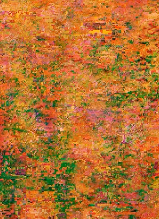
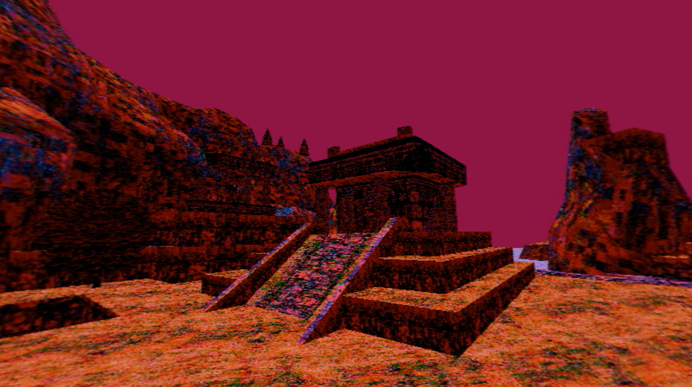
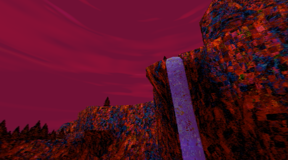
I wanted to revisit it and completely desiccate it of this utopian aesthetic, warp it into something completely new. I found a 3D model for Wuhu Island that someone lifted from the game files and posted online, got it into Blender, and started retexturing areas of it. I replaced the image files for things like the texture of the water, the rocks, the grasses, with short, glitchy and pixellated, oversaturated video textures. They pulsated and ebbed like the walls of the world I felt like I was in during my COVID hallucination. It looked like the world was breathing.
I wasn’t super happy with the colour palette that was emerging though, so I decided to push it further. I had been watching a lot of Twin Peaks, and I really was enjoying the colour palette from that show. It’s a very, very pretty show, and I was particularly attracted to the warmth of it all and how that contrasts with how dark it often feels. There were a couple shots of sunsets that took my breath away while rewatching – these gorgeous, warm pink skies hanging over a dark sleepy town. It felt surreal and fantastic, in the same way that the deliberately stilted dialogue does. All that is to say, even if it might seem kind of disparate, I was inspired by the palette of Twin Peaks in pushing the look of something far beyond reality in order to communicate a vibe.
I opted for richer, warmer colours. The brilliant blue sea became a pale lilac, flecked with dots of mustard yellow and deep red. The lush green grass became a burnt orange, like the land was on fire.
And the sky became a reddish-purple, which, as I selected it as the world colour in the Blender file, drenched everything in a warmer, softer hue. I was immediately really happy with this look and it never really changed, even if I worked on this project for the whole back two thirds of the semester. The pulsating glitching textures were really nice, too. To me, the glitch taking hold and suffusing its way into the skin of every surface and object and building was kind of similar to the now overgrown Chernobyl, reclaimed by nature. It was a dead game abandoned by its player base and its creators, distorted and corrupted over time as it faded from memory. That’s personally the vibe I was trying to create.
For the group tutorial, I whipped up a fairly simple video, where a camera slowly moved through the areas I had completed, backed by an eerie synth track. I say fairly simple but admittedly the process of making it was a little torturous. I was rendering the video out from Blender, with some compositing nodes I set up that dithered and pixellated the footage. Rendering took forever, because every single texture had a constantly playing video file on it (so, like 150 short videos playing at once!), so each frame took several minutes to churn out. Blender renders video into an image sequence, which I then had to take into another software, called Shutter Encoder, and stitch together by hand because it didn’t stay in the order of the file name when I dragged and dropped them all at once. All of that’s to say is that it was insanely time-consuming and I was tearing my hair out by the end of it. I think I finished it around 3AM on the day of the tutorial. I knew that my process needed to get a little simpler if I was to extend it further (it didn’t get simpler). But anyways, here’s the video I showed in class.
The group tutorial gave me clarity on where to go next. I opted for the sort of enormous task of making a VR video. I had never done anything like that before, and I knew it meant I would have to do a lot more work on the technical side of things. But I started to get there! Blender is open-source, which is very beautiful, because it means there’s tons of resources and add-ons for it to basically help you do whatever you want with it. I found one that let you render out VR footage in the Eevee render engine. As I was figuring out how that worked, I kept texturing the rest of the island and populated it with trees. Previously, I had only done as much as was going to be visible in the video, but with a VR work, you can really see anywhere, so it all had to be done up nice.
In the meantime, the second-years were putting together their exhibition project. I made a small little work for it that was using the visual synthesisers hooked up to the CRT. I had found a VHS tape for the IKEA Richmond opening and decided to load that up and mess around with it. I wasn’t really guided by any strict ideas for this, more just experimenting with colour and how interesting and weird I could make the future. I had managed to make the footage look pretty creepy (here’s proof).
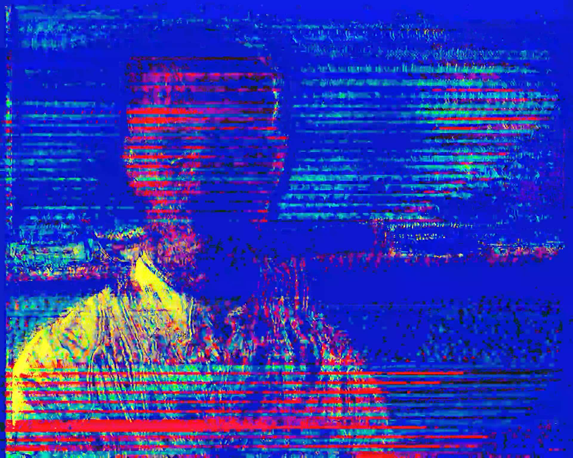
This look was achieved just by abusing blend modes, layering the distorted footage over the normal footage over and over again and doing some fun stuff with the curves. I then took all the little bits of the 15-minute footage that looked creepy and weird, assembled them all together, and that was my video. It was nice to take a break from Blender but I wasn’t blown away by the video I made or anything. It was super cool to see it exhibited, but I’m definitely excited for next year when I’m maybe a little more invested in the actual work I’m showing. Anyway, here’s the video.
Back on the project I was making, it was getting into a state where it was actually possible to start messing around with the VR headset. It still took a comically long time to render, and I was dealing with things like my computer crashing midway through rendering it and me needing to restart. But I did simplify one particularly stupid part of my process, where I needed to drag each clip individually into an encoding program to turn it into a video. I messed around with some coding and ffmpeg to create a script that automated the process of stitching together the individual image frames into a video. I know I could have used something like Premiere, but I kept experiencing issues with that. When you’re working with a work that has hard pixels as an important part of the aesthetic, I’ve found that programs really love to get blurry and weird with the pixels and it always ruins it. So the custom script was the best solution, and it was satisfying to pull it off because I do not know how to code at all.
Another hiccup I experienced was where I rendered out a whole 1 minute’s worth of footage. This took over 16 hours to render, with me needing to keep Blender up and my poor computer whirring up a storm as it struggled under the weight of my request. The footage was a camera walking through a path on the island, but because of how huge the Blender file was, I wasn’t actually able to see what that camera movement really looked like until the rendering was all done. And when it was done, it looked like utter shit. The movement across the path was super janky, and the speed kept changing. It was really disheartening to have spent all that time on it, only for the footage to be pretty unsalvageable, with not a lot of time left til the next group tutorial.
But I managed, by pivoting to a different structure of video. Rather than the camera moving on a linear path throughout the whole video, I decided to have little vignettes of different sections of the island. The camera would sit in one spot for a time, allowing the viewers to look around and take in the surroundings, and then it would cut to a new spot. I was pretty happy with how this format felt. I put in a song, After the Glandolinian War, by Jordaan Mason & The Horse Museum, because I was listening to that album as I was working on the video and it felt the tone well, to me. It coincidentally was released in the same month of the same year as Wii Sports Resort, so the work is kind of like a strange time capsule of June 2009. While this is coincidental, I do like it as a justification for including the song. The work, to me, is partially about my fading memory of this game, that I would have been really into at exactly that time period. So it’s a soundtrack that subtly reinforces the focus on my childhood.
I wanted the video to have more logic to it than randomly swapping between a bunch of different locations, so I built a really small arc into it. The further it goes on, the more distorted the audio gets, and the visuals start to be overtaken by flashing, shifting and swirling colours and lights, until it eventually fades entirely into noise. It’s the final degradation of memory, the death of a dying game. I’m intrigued by the concept of deathbed hallucinations and that was definitely something I drew upon there.
I wasn’t able to see the work on a VR headset until the day I showed it, and that was really cool. It felt completely different, obviously, when I was entirely surrounded by it, rather than prodding at it in Blender and Premiere Pro on my laptop. I was really happy with how it came together. (Heads up, the video looks really weird on YouTube. The way I rendered it to be played through the VR headset has for some reason been really weird on YouTube. I can't really re-render it though, so just switch to 2D mode and pretend you're in VR lol)
The final group tutorial did give me some ideas on how to tidy it up for the final submission. I gave the video more time to breathe, and upped the distortion of the audio, because it wasn’t very noticeable when playing through the crappy computer speakers in the VR room. I still wouldn’t call it finished right now, to be honest, but there’s only so much time in a semester. I am happy with the end result. Here's some stills from the final video.
Thank you for reading all of that and thank you for a great semester!